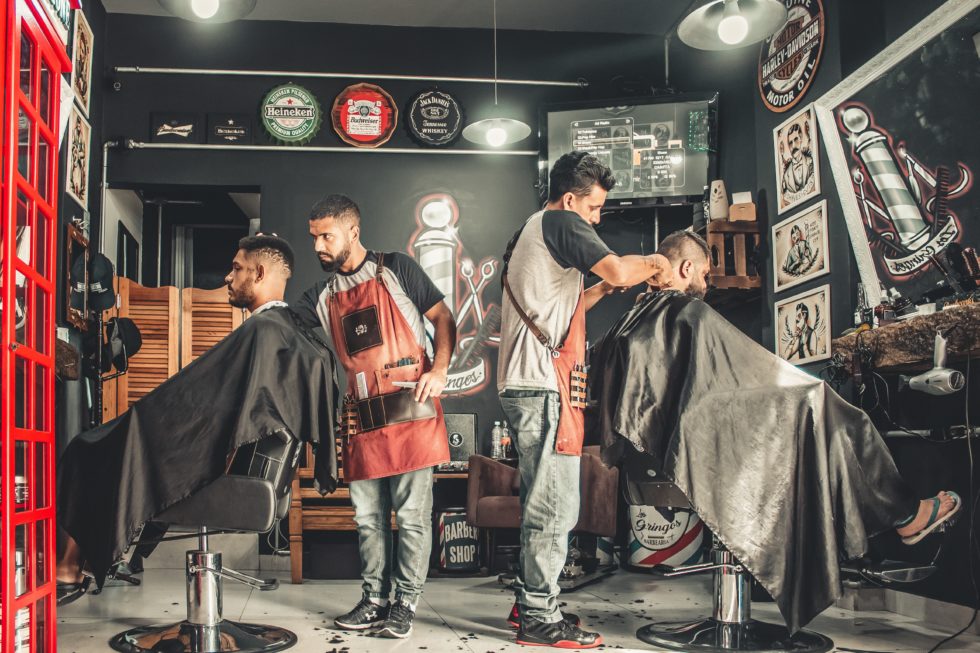
What do the barbershops that get the most new business have in common? They have the best barber websites. A website is the face of your business online, and when it comes to making people look good for a living, you can’t have a site that doesn’t hold its weight. If people are on the hunt for a new place to get their hair cut and styled, they’ll be searching the internet before they step foot in your shop. You need to give them something that will impress and lead them to either contact you or just stop by: a beautiful, quality website. So what are some things that the best barber websites have in common?
An Aesthetic that Reflects Your Business
Obviously, what your website looks like matters, but the design of your site should reflect the style of your shop. Are you more traditional? Cutting-edge? Or do you do it all? A sleek design that reflects the aesthetic of your shop is key for letting people know the type of services you offer, so they know if you have the type of style they’re looking for.
A User-Friendly Design
Your website has to be user-friendly—especially on mobile devices. More than half of all website traffic is generated through mobile. If your website doesn’t work or display well on a variety of mobile devices, then you may be losing customers. Your website should have all of the following attributes when displaying on both mobile phones and desktop computers:
- Content that is written and formatted clearly and concisely.
- Fast load times, since sites that take more than two seconds to load can drive people away.
- Easy-to-use forms that are promptly responded to by someone at your business.
Effective Calls to Action
Calls to action, or CTAs, give your website visitors an opportunity to take a step toward patronizing your business. You typically see these in the form of buttons on a website that say things like “Contact Us” or “Learn More.” Eye-catching and well-placed CTAs make it easier for those who are interested in your services to get in touch with you and make it more appealing while they’re perusing your site as well.
Examples of Your Work
You’d never book someone to renovate your home without seeing examples of their work, right? So why would anyone take a chance on a barber that didn’t proudly post examples of their work? Including on your website a great collection of past cuts and styles that you and your team have done is crucial. Many new customers make their decision to contact your business based on examples of work and what they want for themselves. Additionally, it’s important to have a solid gallery of the interior of your shop. This gives people a sense of the vibe inside and what they can expect when they walk in.
Prominent Contact Info
Make sure your contact info is easy to find and prominent. The best barber websites have contact info readily available on every page and include a contact us page, too, just for good measure. You want people to be able to call and book an appointment, so make sure they know how to reach you!
If you’re looking for a new, affordable, and sleek website for your barbershop, Salon Search Party can help! Contact us today to find out more about pricing and options or to get a free marketing evaluation.

